

If you've ever written CSS to align and position elements, you've probably encountered some headache inducing problems, which is understandable given that it wasn't always easy. I frequently found myself writing strange hacks in at Diki.dev, wether it's adding unnecessary containers, using floats in too many places, and having absolutely positioned children in relatively positioned parents.
Gone are the headaches with Flexbox, we can solve the majority of layout issues with just a few lines of code. This post will give you an overview of all the properties you need to know.
Flexbox container properties
When you set display: flex on your container element, all flex properties with default values are applied to your container and its direct children (flex items). We'll take a close look at all properties to see why, for example, after merely setting display: flex, all flex elements suddenly line side by side.

Flex Direction
flex-direction: row | column | row-reverse | column-reverse
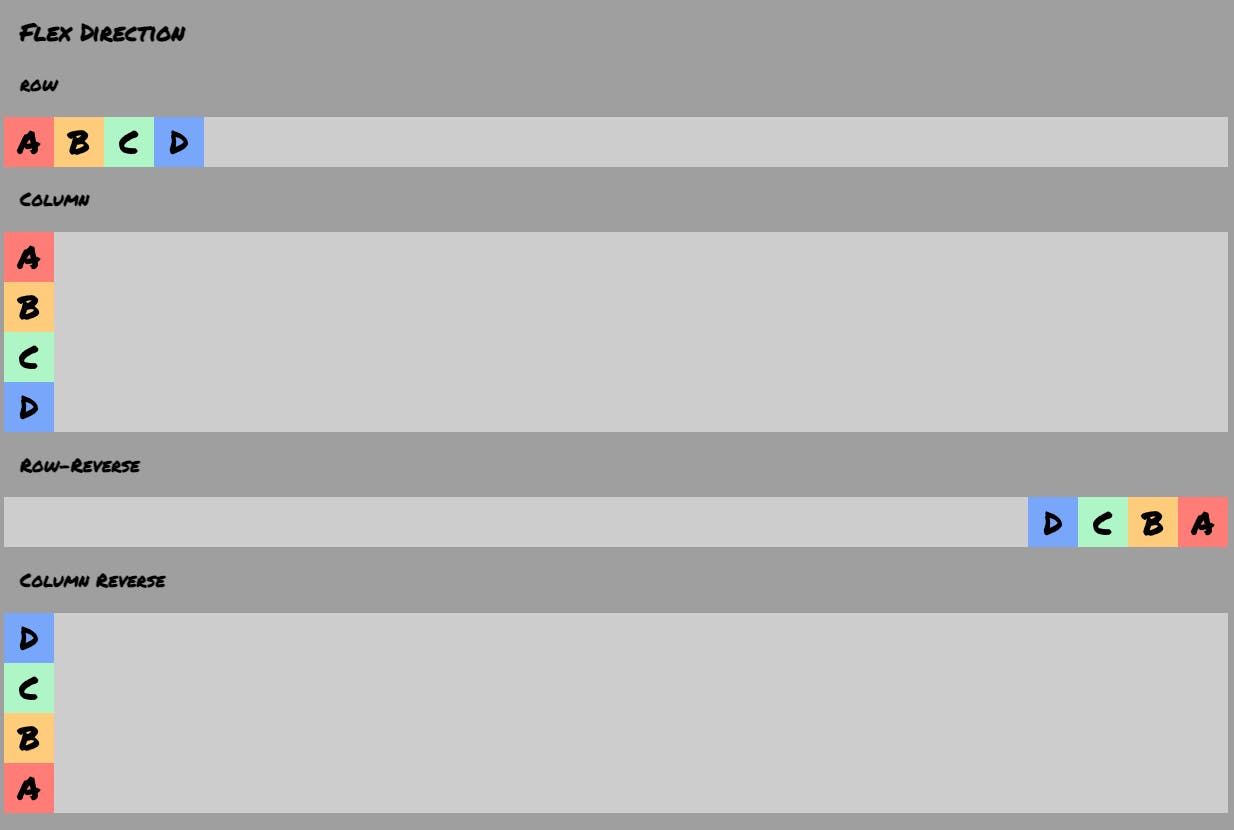
Every flex container has a main axis defining the direction flex items are placed. By default flex-direction is set to row, which means that the main axis goes from left-to-right. If you have it set to column the elements would stack from top-to-bottom as they would do without using Flexbox.
Justify Content
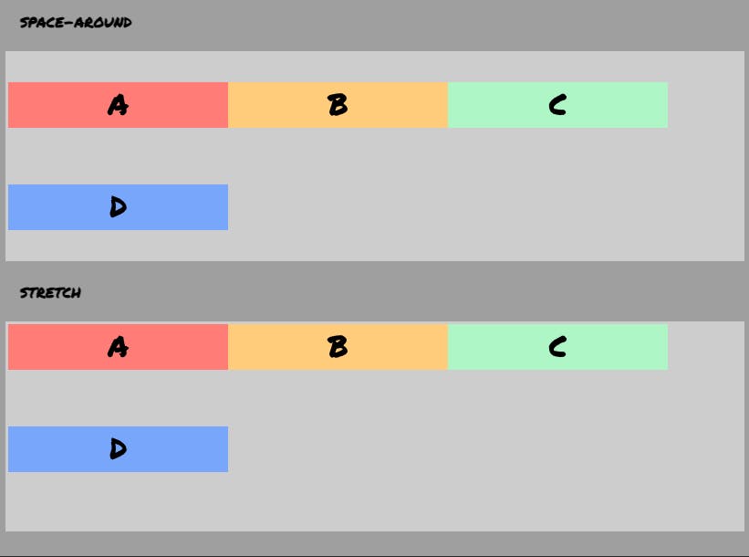
justify-content: flex-start | flex-end | center | space-between | space-around
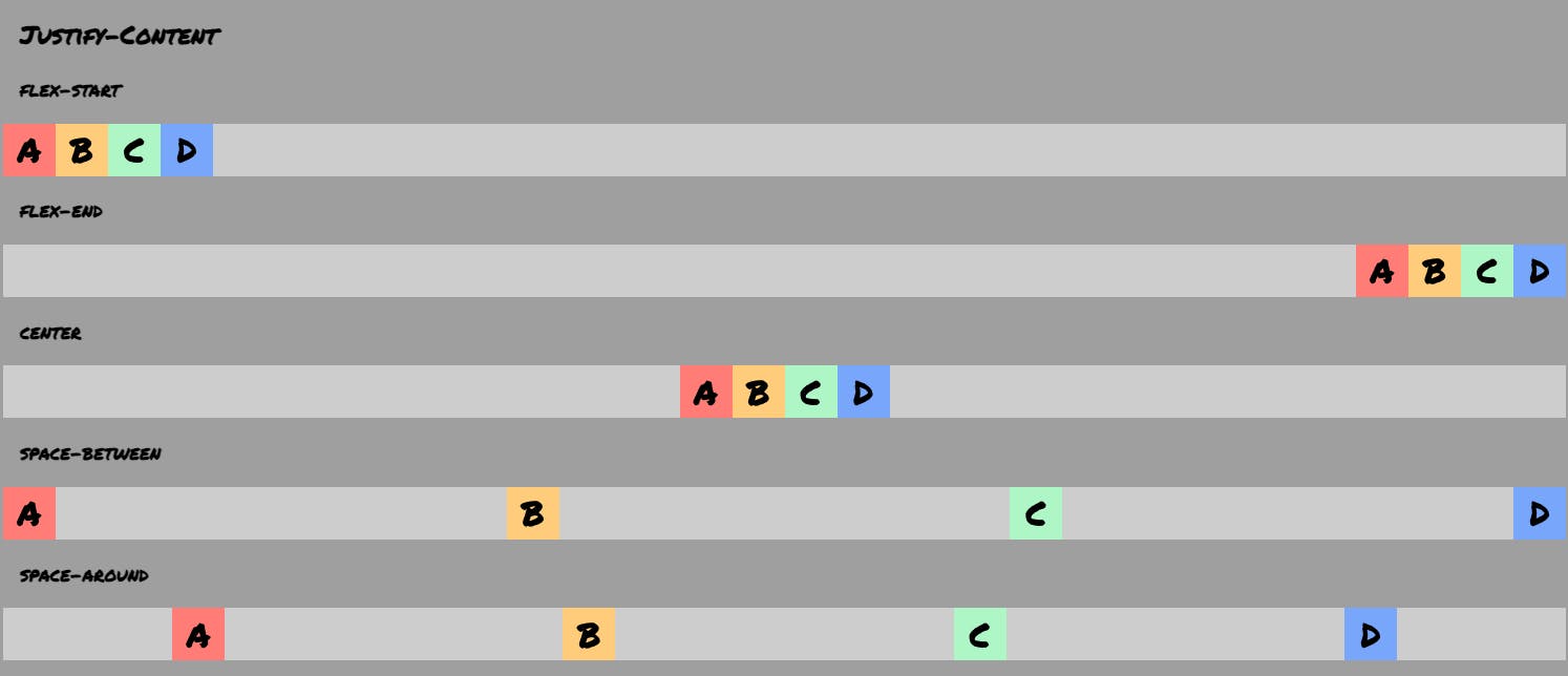
To distribute our flex items along the main axis, we can use justify-content. It is set to flex-start by default. Be mindful that flex-direction has a direct impact on justify-content. justify-content: flex-start implies to pack all flex items to the start of the main axis, which is why all flex elements are displayed on the left side by default. Center, well, centers the pieces, but the interesting ones are space-between and space-around. Space-between distributes the remaining space evenly between the items, while space-around accomplishes the same thing except that the first and last items have no space towards the container's boundary.
Align Items
align-items: flex-start | flex-end | center | baseline | stretch
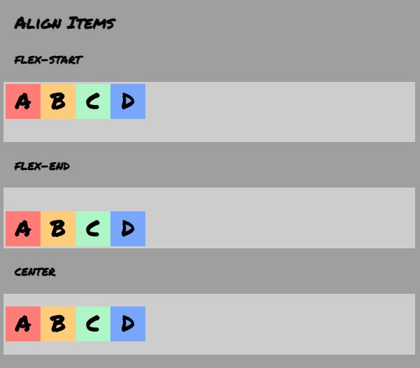
align-items is basically the same as justify-content only for the cross axis. If the main axis is horizontal, the cross axis is vertical (top-to-bottom), if the main axis is vertical, the cross axis is horizontal (left-to-right). align-items: flex-start | flex-end | center are self-explanatory and baseline is useful if you want your items text content to be aligned.
Flex-Wrap
flex-wrap: nowrap | wrap | wrap-reverse
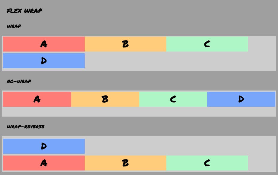
In this instance, all the flex items have explicit widths set to 30%. If there are more than three things in the container, we would ordinarily expect the fourth item to overflow or break into the following row.
However, because flex-wrap is set to nowrap by default, this does not occur. When we use flex-wrap: wrap, the fourth item becomes a second row.
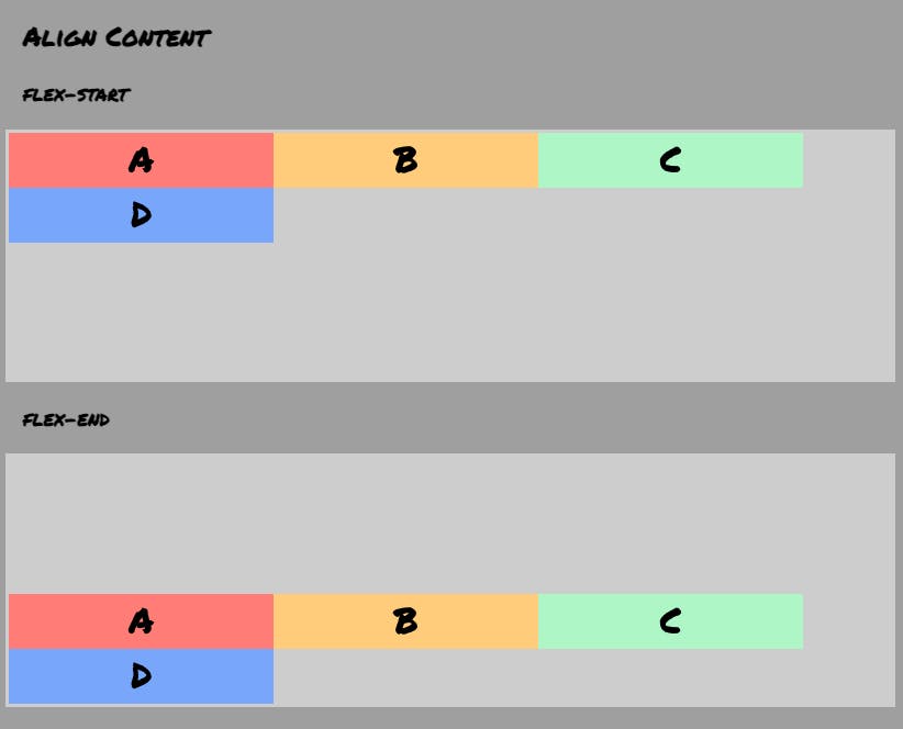
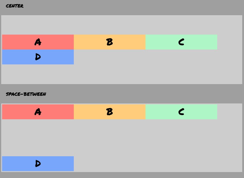
Align-Content
align-content: flex-start | flex-end | center | space-between | space-around | stretch
When there is any type of wrapping, that means we have multiple rows or columns. These item groupings can also be arranged on the cross axis. When we have two rows, the second row begins right in the centre of the container. Because align-content is set to stretch by default, the boundaries are stretched into two even halves. We can stack the rows to the top with align-content: flex-start, to the bottom with align-content: flex-end, and so on.
Flexbox item properties
Order:
nth-child(number)
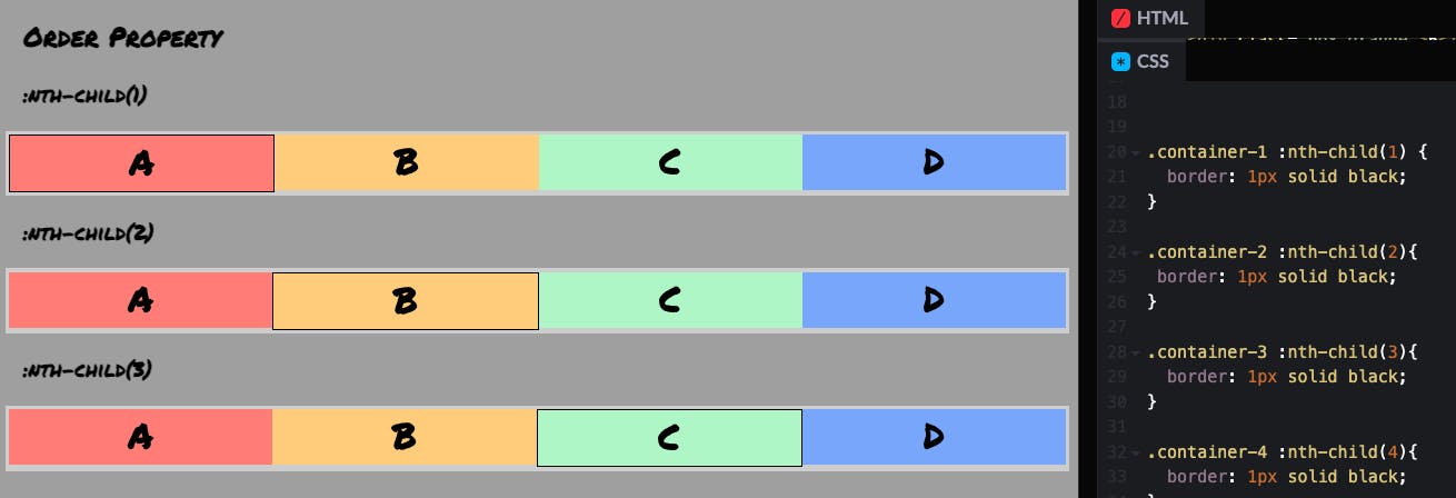
order: <number>
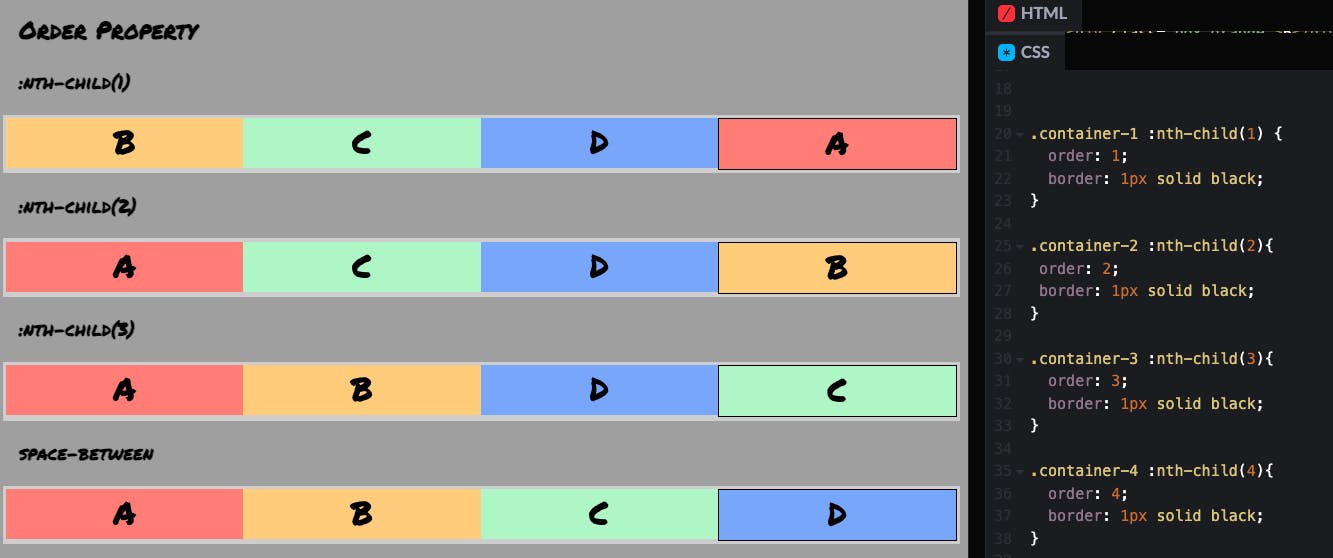
With the order property you can reorder the appearance of specific items. The number you specify defines the priority of the item in the ordering. An item that has order: 2 will appear before another one that has order: 1. If both items have the same order priority, they appear in their natural DOM order. All items have an order property set to 0 by default.
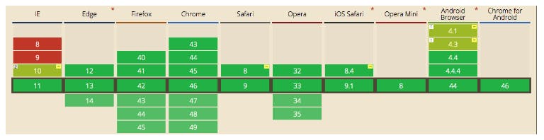
Compatibility
Flexbox has been around since 2009, and it’s beginning to be widely supported by all modern browsers. If you look at Flexbox on Can I Use? you’ll see that it has great support across the board.