

Adding Depth and Visual Delight: The Power of Gradients in UI Design


Mastering Gradients in Modern UI Design
For a considerable period, the utilization of gradients was strongly discouraged in design. Designers avoided gradients because they evoked a distinct 90s design aesthetic.
However, that perception has changed significantly. If you currently explore platforms like Dribbble or Behance, you are likely to come across numerous designs that embrace gradients. These modern gradients are vibrant and bursting with colors.
In this article, I aim to provide valuable insights on effectively incorporating gradients into design.
Why do designers now favor gradients in design?
To understand this, we need to reflect on the year 2014. It marked the rise of flat design, with Google introducing Material Design and Apple adopting a flat UI design for their macOS. Flat design was a refreshing departure from skeuomorphic design and gained immense popularity.
Nevertheless, flat design also presented limitations, particularly regarding the range of colors and styles available to designers. It became challenging to identify more than 10-15 colors suitable for flat design.
Gradients prove to be a remarkably versatile tool, enabling designers to:
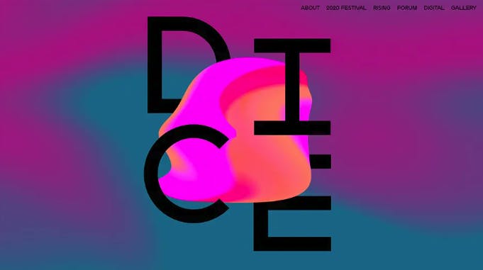
Make bold statements: Applying a gradient to even the smallest element, such as a logo, can infuse it with excitement and freshness.
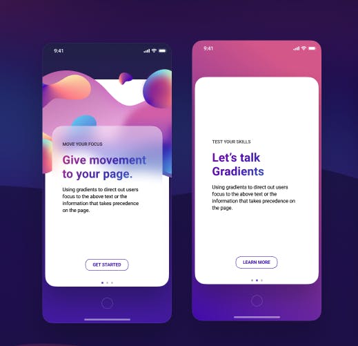
Emphasize specific elements: Exceptional user experience intuitively guides users through a product. Well-designed gradients subtly direct users' attention towards focal points. By intensifying certain parts of a page, visual weight is increased, making those elements more noticeable.
Gradients are perfect for drawing attention to particular areas. Eddie Lobanovskiy effectively utilizes gradients to highlight key messages.
Here are our tips for creating impressive gradients:
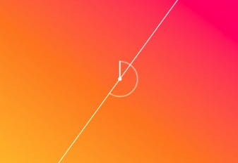
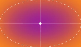
Familiarize yourself with basic gradient types: Gradients can be categorized into several types. Three common ones are:
a. Linear: Progressing colors in a straight line
b. Radial: Radiating colors from a central point.
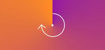
c. Conic: Colors arranged around a circular gradient.
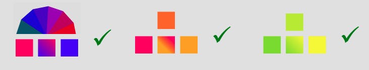
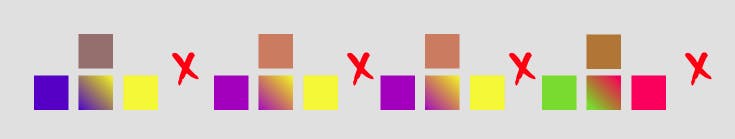
Avoid random color choices: Not all colors complement each other. Transitioning between complementary colors can result in unappealing gradients. Instead, opt for analogous colors (neighboring colors on the color wheel) or shades of the same color.
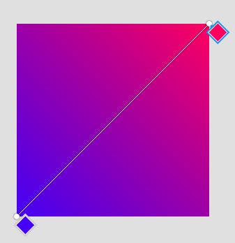
Ensure smooth transitions: Seamless color transitions are crucial. Users should not perceive any abrupt shifts between colors. Spending time adjusting color stops helps achieve a smooth transition.
Use gradients to direct the user's focus: Gradients can guide users' attention to specific areas, making them particularly effective for smaller elements like call-to-action buttons or titles.
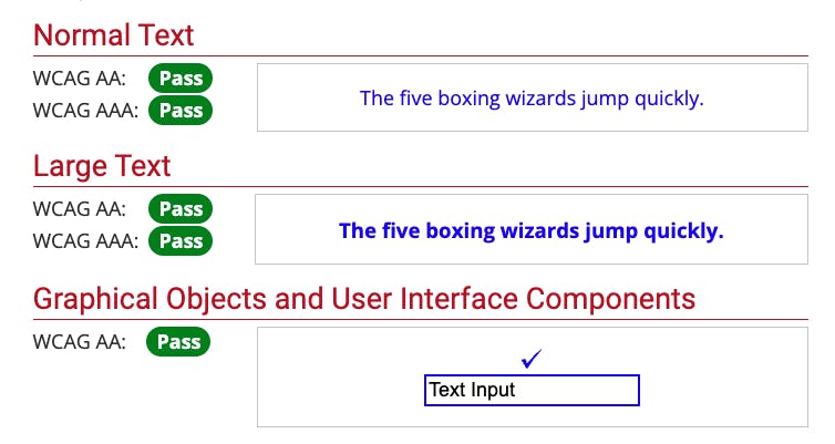
Ensure color contrast: Regardless of the design's aesthetic appeal, accessibility should never be overlooked. Always verify the color contrast ratio, following WCAG 2 guidelines for readability and usability.
We love webaim.org contract checker ❤️
In conclusion, the once-discouraged gradients have experienced a remarkable resurgence in modern UI design. Previously associated with outdated aesthetics, today's gradients are vibrant and captivating, infusing designs with enthusiasm and novelty.
Designers have enthusiastically embraced gradients as a versatile tool for expressing bold ideas, highlighting specific elements, and guiding user attention. By thoroughly understanding various gradient types, carefully selecting colours, ensuring smooth transitions, and paying attention to colour contrast, designers can create impressive gradients that enhance the user experience. As the design landscape continues to evolve, mastering gradients has become an essential skill for modern UI designers, enabling them to create visually appealing and engaging interfaces.